Thursday, 9 May 2013

evaluation for final piece


this process of making this magazine was harder than the preliminary as a music magazine ventures out into film, new artist's and other commercial goods. layering everything was the hardest where to put things in place really took patience and skill which is hard when it comes to using photoshop. the things i wanna do next time is not make my magazine not look to loud and mixed match although i wanted it to come from my personality. the thing that went well is that it broadened my mind i thought when i first went to media that it was going to breeze no, its not it takes time energy and skills, it has definitely challenged me which i'm thankful to get because it pushes me to do my best and try my hardest but overall with this process i am happy with what i have done and completed.


Tuesday, 7 May 2013

final Preliminary task.


preliminary task

I have finally completed my preliminary task it took a few days and was very hard to think of a name a location what to wright for my contents page how to make it stand out from others and whats icons to use but in the end I have come to a final decision and to me I think it came out pretty decent for my first magazine . originally I was working with a partner but as the year went on we drifted apart so I decided to go solo and do my own thing, this was hard as we made ideas and decisions with each-other but life and my education must go on.

I used the name Johnny Blaze Sixth Form Magazine as it was a cooky idea but made more sophisticated I wanted it to be taken seriously. coming up with the name was very hard due to the fact that a name can either sound silly,catchy or just amazing this is none of them to me this name is fun and mimics my original school founder St John Bosco .
 
The font cover was hard to find and i used joopmag.com to help me edit and alter my magazine to make it look at least some sort of professional i used a picture of my friend sitting on a bench by herself with the sun gleaming over the school playground with trees in the background it is very plain but the picture is epic the colours mesh and clash together the green trees  clashing against the big brown oak looking tree against the turquoise dark blue sky, the colours of the scenery was very seductive for someone who is art mad.


taking pictures for my magazine was very hard I wanted it simple but not to simple I defiantly could of taken some of kids in class but i wanted it to look at least a bit adultish compared to a cartoony looking school magazine. I found editing it really hard try to get everything to look good and to put things in place it is very time consuming and very hard i never knew so much went into making a magazine.
 I could've made my contents page a bit brighter to match my front cover but i am proud with it's look; it looks modern and the contents has a few cheeky bits in it.
my goal was to make a modern young sophisticated magazine which is almost impossible to find  I suppose to me mine has lived up to its looks it looks young and fresh and I am completely happy with it and I would only tweek my contents page a bit more but overall I am pleased with my magazine.

Wednesday, 1 May 2013

AS media task

my media task is starting off today on may the 1st on may 2nd i am hopefully taking the camera to take pictures of what i need to then start publishing my preliminary idea to pass my media i need to think about location and lighting i want this to be as perfect as i can location is very important to me because i dont want to use a room that looks messy or too positioned i want it to look natural like i ttok the picture without anyone knowing.

AS media preliminary task

for my preliminary task i have to make a school magazine for this i am going to need to 4 photo's of my school saint john bosco with some friends of mine and were going to be smartly dressed to represent our sixth form i havent thought of a new name for the magazine and i am going to be taking pictures of the school by the gates to show the school and in the canteen and maybe in a classroom my contents page will consist of what going on, news of the term, upcoming projects, summer prom and teachers announcments this will be a very hard task to create the magazine using adobe photoshop to make this magazine stand out from the rest it is going to take time and prosiction and alot of determination to make this happen in a short time. i will be trying my hardest to make this not look homemade but look professional.

Monday, 18 March 2013

http://www.oratory.co.uk/downloads/School%20Magazine/Oratory%20Magazine%20Iss_169%20(Low-res).pdf

this is the london oratory school magazine this is an amazing magazine for a school they have a well done context page which tells you where everything is and brief notifications the only reason why i like this magazine is because it focuses only on the school and the fun around the school the actvities and the upcoming event with a brief headmaster paragraph called the headmasters study which shows that the headmaster is intrested in the outlook of the school compared to st thomas moore.

Monday, 11 March 2013

st thomas moore school magazine

this is St Thomas Moore schhol magazine called ATOMIC it is very plain with a poor design and its more of a leaflet or a flyer rather than a magzine they promote the winner of the school talent show and prom but they need more pages talk about whats going to happen in september, what teachers are leaving, how the schools going to change and gcse results. the magazine is only small with about 5 pages which gives info from the students i suppose about prom the film to watch of the month, the upcoming pplays or choir rehearsals this magazine is alright but on the desighn and layout its to clustered and looks very hard to read the words should be clearer for example the prom paragraphs are in a bigger writing than the radio road show which it shouldnt everything on one page should be consistant.

the source 2007

the source one of the most famous urban magazines in amercia released this 2007 of the rapper game in a black hoodie with a title saying "No Apologies" he's in a black hoodie with fake bloodstaines looking rough and ready for a boxing match. the header is "rise of the bloods" which is a famous american gang the bloods vs crips which is a massive gang warfar so to me this issue of the magazine looks like its promoting violence because theyre would be stories abou people from the gang injured or dead because they are in a gang

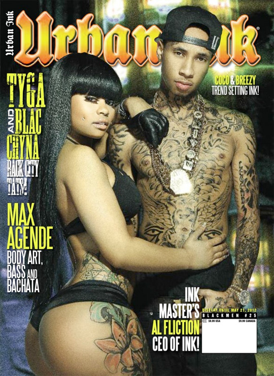
urban ink, music, tattoos and art

urban ink is a tattoo, music and art magazine which shows off the artist at the top tyga with his girlfriend blac chyna showing off her ink and they done an interview talking about his upcoming projects new album etc. the cover is very bold with black and bright tattoos with a semi naked girl to catch someones eye the background in like a street look to make them be seen as gangster ( ghetto) to appeal to fans of the urban scene

Tuesday, 5 March 2013

this was a magazine page where they advertised lil kim's return to the music indusrty to give her promotion so because they want people to talk about they made her high fashion with a bathing like suit the red bottom high heels with long brownish blondish hair almost like a barbie look for lil kim like shes ready for whatever happens this photo is plain but epic the writing is fancy and stands out from the grey looking background as she poses on this suede bench
rolling stone magazine ft rihanna has like mirrored images on both sides of the original artist she has brown to blondish hair against a white background covering the rolling stone title and at the bottom refers her to crazy in love so this draws you in to see if she is or isnt with her so called bf and big blsck writing about billy joel ready for a comeback so fans of him would want to see his new projects.
this is the cover to q music magazine at the front we have jessie j standing with her model billed height at 5'9 in short shorts looking like a rockstar in avery et pose she has very dark makeup to make her look rocky the picture is very plain but effective it stands out and has her name in pink with a big kiss and massive red pouty lips this would sell to hardcore fans of jessie j but also music lovers of the artist theyve included on the side of the cover. 

Tuesday, 22 January 2013

brief

the purpose of the unit is to assess your abilty to plan and form media samples using the appriate technical and creative skills, also to asses your knowlidge of understanding evaluation in your work ( showing the meanings and the purposes and why things are put in place, and responses are created) this project will test your ability to apply and present the appropriate amount of research and also using media technologies and terms giving us the opprtuninty to devolope our skills.
the coursework we will do will be assesed and moderated. we would have to show a media response to the project set; we would also have to show the right amount of research and planning.this project will also show our skill devolpments that we have learnt

Tuesday, 4 December 2012

Vibe is a music and entertainment magazine founded by producer Quincy Jones. The publication predominantly features R&B and hip-hop music artists, actors and other entertainers. After shutting down production in Summer 2009, Vibe was purchased by the private equity investment fund InterMedia Partners and is now issued every-other month with double covers, with a larger online presence. The magazine's target demographic is predominantly young, urban followers of hip-hop culture.
The magazine owed its success to featuring a broader range of interests than its closest competitors The Source and XXL which focus more narrowly on rap music, or the rock & pop-centric Rolling Stone and Spin. As of June 30, 2012, Vibe had a circulation of 300,943, of which 202,439 was paid, and 98,504 was non paid.Advertisers ran the gamut from record labels to fashion houses to various cognac brands.
Quincy Jones launched Vibe in 1993, in partnership with Time Inc. Originally, the publication had been called Volume before co-founding editor, Scott Poulson-Bryant gave it the name Vibe.Though hip-hop mogul Russell Simmons was rumored to be an initial partner, publisher Len Burnett revealed in a March 2007 interview that Simmons clashed with editor-in-chief Jonathan Van Meter. Miller Publishing bought Vibe in 1996, and shortly afterward bought Spin. Private equity firm, The Wicks Group, bought the magazine in 2006.
Jonathan Van Meter's successors were Alan Light, Danyel Smith, Emil Wilbikin, Mimi Valdes, and finally Danyel Smith again.
On June 30, 2009, it was announced that Vibe was shutting its doors and ceasing publication immediately,although according to Essence, Quincy Jones has stated he would like to keep it alive online.
After shutting down, private equity investment fund InterMedia Partners, LP bought Vibe Magazine. They have said they "feel privileged to purchase and resurrect such a storied brand." They added Uptown magazine to Vibe's parent company, Vibe Holdings. Ron Burkle and Magic Johnson later invested in the company. Vibe Holdings merged with BlackBook Media to form Vibe Media in 2012.
the coleour scheme for vibe is black white/silver and red the red is to stand out an show a sexy ciara and her image is to be feminim but a goddess at the same time she is in a sitting position which is fun yet very flirtacious like look at me boys im here plus she is very tall her height is 5'10 it high platform shoes. she is also nude on the cover embracing her sexiness.
the red stands out
Complex is a young men's style/lifestyle magazine founded by Marc Ecko in 2002. The publication offers mainstream readers insight into the latest trends in niche cultures, such as streetwear, sneaker culture, hip hop, and graphic art. Complex has a stated monthly circulation of approximately 300,000 and targets men that are college-aged to early 30s in urban/metropolitan areas
One of the magazine's unique attributes is that each issue features a different cover on each side (one male, one female), creating two distinct sections. The half of the magazine that follows the male celebrity cover (e.g., Kanye West, Seth Rogen, Pharrell, Kobe Bryant, James Franco) is geared toward lifestyles, the latest films, music, and other forms of media. The half of the magazine that follows the female celebrity cover (e.g., Jessica Alba, M.I.A., Cassie, Rosario Dawson, Olivia Munn, Gwen Stefani, Mila Kunis) is dubbed "The Guide" and offers a Consumer Reports-esque breakdown of the latest consumer items, technology, sneakers, and apparel. It is known as "The Original Buyer's Guide for Men" because it was the first magazine in the men's market to emulate the shopping guide formula of Lucky and the Japanese magazines on which that magazine was modeled.
Two years after its launch, big publishing houses like Condé Nast Publications attempted similar titles, like Cargo, Sync, and VITALS, all of which folded within two years of launch.
XXL (pronounced double-ex el) is a hip hop magazine, published by Harris Publications, founded in 1997. this magazine focuses on hip-hop but also introduces new artist to look out for and they're predictions on how famous they would become this magazine cover really stands out as it has a clash of men in bright colours and one with a bear hat there is only one lady in an emu looking coat that stands out in the roight hand corner of the magazine logo is massive big white letters stand out with a box like shape. 
The Source is a United States-based, monthly full-color magazine covering hip-hop music, politics, and culture, founded in 1988. the front cover is very 80's and very stylish as it portrays wiz as modern day Jimmie Hendrix this magazine will appeal to all types of age culture as the magazine portays a mix of pastel colours you have yellow,black, whit, fusia , brown and red.this also has big names which will attract other fans of Nicki Minaj to see an interview of her or new music so this is cleverly put out.
this is q magazine it is a music magazine about mainly indie music but features other artists and what they like about music. this magazine is a weekly magazine and is a very well put magazine the front cover was a page with glossy style to it a soft texture of paper it is based on guitar bands like the kooks, the script and maroon 5 this magazine gives expsosure to a new audience that will surley search up the artist on youtube the magazine also has exclusive interviews based only on music and not the artist personal life the contents page is plain but effective as it gives you and idea of what the band or artist portrays in its little window.